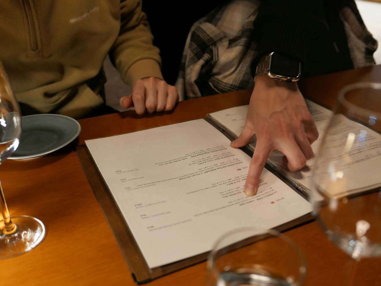
Menu psychology is the study of how customers make decisions when they read a menu.
It is not about tricking people.
It is about understanding how real customers choose.
Most customers do not read every item carefully from top to bottom. They scan. They compare. They look for familiar options. They notice prices. They avoid items that feel risky. They choose what feels clear, safe, valuable, or worth trying.
That means the menu is not just a list of products.
It is a decision environment.
For restaurants, cafés, bars, bakeries, food trucks, takeaway businesses, hotels, and other hospitality businesses, understanding menu psychology can help explain why some items sell, why others are ignored, and why certain prices feel fair while others feel expensive.
Quick answer
Menu psychology explains how customers choose what to order by looking at how they scan the menu, compare items, react to prices, evaluate value, and avoid risk.
Customers usually choose based on a mix of:
- visibility,
- familiarity,
- price,
- perceived value,
- item descriptions,
- section structure,
- comparison with nearby items,
- safe choices,
- and confidence that the item will meet expectations.
A good menu makes decisions easier.
A weak menu makes customers hesitate, compare too much, or default to the safest option.
Customers scan before they decide
Most customers begin by scanning the menu.
They do not give every item equal attention.
They look for signals:
- section names,
- familiar words,
- prices,
- popular items,
- premium items,
- short descriptions,
- visual highlights,
- bundles,
- specials,
- and anything that feels easy to understand.
This first scan matters because it shapes what the customer notices.
If an important item is buried, it may never enter the decision. If a weak-margin item is very visible, it may get more attention than the business wants. If a premium product is hard to find, it may underperform even if it is strong.
Visibility affects choice.
Customers cannot choose what they do not notice.
Customers compare inside sections
Customers rarely judge one item alone.
They compare it with nearby options.
A $16 item may feel expensive in one section and reasonable in another. A $24 product may feel premium if the menu supports it, or overpriced if the value is unclear.
For example:
- Classic Burger — $13
- Cheeseburger — $14
- House Burger — $16
- Premium Beef Burger — $24
The premium burger may be valid, but the customer needs to understand the jump.
If the description explains the ingredient quality, portion, preparation, and included sides, the price can feel easier to accept. If the description is weak, the customer may avoid it.
This is why section structure matters.
Customers compare options close to each other.
A menu should make those comparisons clear.
Customers look for safe choices
Many customers do not want to take a risk when ordering.
They want something they can understand quickly.
Safe choices are usually:
- familiar,
- clearly described,
- fairly priced,
- easy to imagine,
- not too expensive,
- and not too unusual.
Safe choices are important. They help customers feel comfortable.
But they can also dominate the menu if other items are not supported well.
If the safest item is also the cheapest and most visible, customers may choose it by default. That can lower average spend or pull attention away from better-margin items.
The goal is not to remove safe choices.
The goal is to make sure the menu also gives customers good reasons to explore, upgrade, or choose stronger items.
Customers avoid risk
Customers avoid items that feel uncertain.
An item can feel risky when:
- the description is unclear,
- the ingredients are unfamiliar,
- the price is high,
- the portion is uncertain,
- the item looks very different from the rest of the section,
- the value is not obvious,
- or the customer cannot imagine what they will receive.
Risk matters more when prices are higher.
A customer may try something unfamiliar at $6. They may hesitate at $24.
This does not mean premium or unusual items should be avoided.
It means they need better support.
To reduce perceived risk, the menu can use:
- clearer descriptions,
- familiar reference points,
- ingredient quality,
- preparation details,
- included sides,
- “house” or “signature” framing,
- staff recommendations,
- or a stronger section structure.
Customers are more willing to choose something new when the menu helps them feel confident.
Customers react to price signals
Prices send signals.
They do more than show cost.
They can make an item feel:
- accessible,
- standard,
- premium,
- too cheap,
- too expensive,
- good value,
- or hard to justify.
Customers compare prices with expectations and with nearby items.
For example:
- Coffee — $3.00
- Latte — $4.50
- Specialty Latte — $5.50
- Seasonal Signature Drink — $6.50
This price ladder feels logical. Each step gives the customer a reason to trade up.
But if the prices look like this:
- Coffee — $3.00
- Latte — $5.90
- Specialty Latte — $6.10
- Seasonal Signature Drink — $6.20
The structure becomes less clear.
The latte feels much more expensive than coffee, but the premium options feel almost the same as the latte. That can confuse the customer.
Price signals should help customers understand the menu.
When they do not, customers hesitate or choose the safest option.
Customers decide what feels valuable
Value is not only about being cheap.
A product can be expensive and still feel like good value.
A product can be cheap and still feel disappointing.
Customers decide value by asking, often without thinking about it directly:
“Does this feel worth it?”
That feeling can come from:
- ingredient quality,
- portion size,
- preparation method,
- uniqueness,
- freshness,
- brand expectation,
- included extras,
- presentation,
- description,
- and comparison with other items.
Compare:
Chocolate Cake — $8
With:
Warm Chocolate Cake, Vanilla Cream, Toasted Hazelnuts — $8
The price is the same, but the second version gives the customer more reasons to accept it.
Good menu psychology makes value easier to understand.
Descriptions shape decisions
Descriptions are not only decorative.
They help customers imagine the item.
A strong description can make an item feel clearer, more valuable, and less risky.
A weak description can make a good item feel ordinary.
For example:
Grilled Chicken — $18
This is clear, but basic.
Charcoal-Grilled Free-Range Chicken, Lemon Herb Jus, Roasted Potatoes — $18
This gives more context. It explains preparation, quality, flavor, and what is included.
Descriptions are especially important for:
- premium items,
- signature items,
- unfamiliar products,
- high-margin items,
- products above the section average,
- and items the business wants customers to notice.
The goal is not to make every description long.
The goal is to make the right items easier to understand.
Customers use anchors
A price anchor is a reference point that helps customers judge other prices.
A premium item can make other items feel more accessible.
For example:
- Classic Pasta — $15
- Mushroom Pasta — $17
- Seafood Pasta — $21
- Truffle Pasta — $29
The $29 item may not sell the most, but it can help the $21 item feel more reasonable.
Anchors can be useful, but they need to be credible.
If the premium item feels unsupported, customers may ignore it or see the menu as overpriced.
A strong anchor should feel:
- clearly premium,
- well described,
- believable for the business,
- different from standard items,
- and connected to real value.
Anchors work best when they make the menu easier to understand, not when they feel artificial.
Customers often choose the middle
Many customers avoid the cheapest and most expensive options.
They look for the comfortable middle.
This is why the middle of a menu section is important.
For example:
- Basic Burger — $12
- House Burger — $16
- Premium Burger — $23
The house burger may be the item the business wants customers to choose most often.
But it needs to feel like the best value.
If the basic burger is too attractive, customers may trade down. If the premium burger is poorly supported, customers may avoid it. If the house burger description is weak, it may not feel worth the jump.
The middle option should usually be clear, attractive, and easy to justify.
A well-supported middle option can improve customer confidence and menu performance.
Too many choices create hesitation
More choice is not always better.
A menu with too many similar options can make customers slower and less confident.
This can happen when:
- sections are too long,
- items sound too similar,
- prices are too close,
- descriptions do not explain differences,
- categories overlap,
- or the menu lacks clear item roles.
When customers face too many similar options, they may default to the safest or cheapest choice.
That can hurt premium items, specials, add-ons, and higher-margin products.
A strong menu does not need to show everything at once.
It needs to help customers choose.
Menu structure guides attention
The way a menu is organized affects how customers move through it.
Important questions include:
- Are sections clear?
- Are categories easy to understand?
- Are premium items supported?
- Are add-ons visible?
- Are high-value items buried?
- Are popular but low-margin items too prominent?
- Are similar items grouped logically?
- Does the menu help customers compare?
Structure matters because customers make decisions inside the menu environment you create.
If the structure is confusing, customers may not choose the best item for them or the best item for the business.
Good structure reduces friction.
It makes the decision feel easier.
Customers notice inconsistency
Customers may not analyze the menu like a spreadsheet, but they notice when something feels off.
They may notice if:
- one item seems much more expensive than similar items,
- a premium product has a weak description,
- a basic item feels too cheap compared with others,
- section prices feel random,
- portions are unclear,
- or several items appear to do the same job.
These inconsistencies create hesitation.
A customer may not say, “This menu has weak price architecture.”
They may simply think:
“I’m not sure this is worth it.”
That feeling can be enough to change the order.
Menu psychology is not manipulation
Menu psychology should not be used to trick customers.
A good menu helps customers understand value.
It makes options clearer. It supports fair pricing. It gives premium items proper context. It helps customers compare. It reduces confusion. It makes the business easier to understand.
The goal is not to force customers into the most expensive choice.
The goal is to help customers feel confident about what they order.
When the menu works well, both sides benefit.
The customer feels clearer.
The business sells the right mix of products.
How to improve menu psychology
To improve menu psychology, review the menu from the customer’s point of view.
Ask:
- What do customers notice first?
- Which items feel safest?
- Which items feel risky?
- Which prices feel unsupported?
- Which premium items need better explanation?
- Which items are too hidden?
- Which cheap items may be too attractive?
- Which sections are too crowded?
- Which descriptions are too weak?
- Where do customers have a clear reason to trade up?
Small changes can make a big difference.
Sometimes the solution is not a full redesign.
It may be:
- a clearer section,
- a better description,
- a stronger price ladder,
- better placement,
- fewer overlapping items,
- a more visible add-on,
- or a clearer premium option.
How MenuLab helps
MenuLab helps hospitality businesses analyze how their menu may influence customer decisions.
Instead of only looking at prices one by one, MenuLab helps review the menu as a decision environment.
That can help identify:
- items that may be too hidden,
- prices that may feel unsupported,
- confusing price gaps,
- weak premium anchors,
- sections that may be too crowded,
- descriptions that may not explain value,
- cheap items that may pull customers down,
- and menu structure issues that may affect what customers choose.
The goal is not to make every menu follow the same formula.
The goal is to help each business understand how its own menu may be shaping customer decisions.
Better menu psychology starts with better visibility.
Final thought
Customers do not choose from a menu only by reading information.
They scan, compare, react, avoid risk, and look for value.
They choose what feels clear. They choose what feels safe. They choose what feels worth it. They choose what the menu helps them understand.
That is why menu psychology matters.
A strong menu does not just list products.
It guides decisions.
Before changing prices, redesigning the menu, or adding new items, look at how customers may be reading the menu today.
The answer may explain more than the sales numbers alone.